Branding with Color: Spotlight on Denver
From time to time, we like to use this space to spotlight brands that stand out from the rest of the crowd in some aspect of their marketing or advertising output. This time around, we thought we’d feature the efforts of local companies as well as those headquartered in either the Denver area or the state of Colorado throughout this month’s four-part series covering different topics related to branding. For the first post in this series, we will be using Denver and Colorado-based companies to illustrate the importance and prominent use of color in branding.
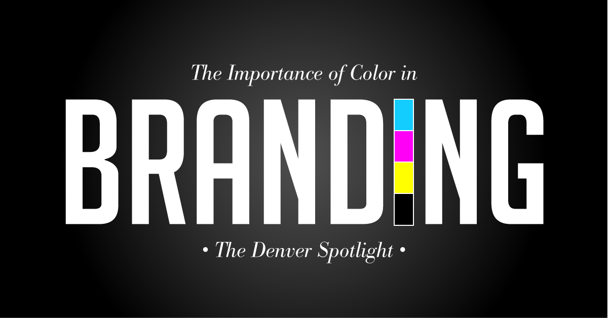
The way your brand looks is just as important as the language used in your messaging. For instance, when advertising within the available space contained in a 30 second commercial, a 14 ft x 48 ft billboard or a quarter page print ad, only so much can be explicitly expressed. The remainder of the heavy lifting needs to be performed by other pieces of your branding arsenal besides the words you use. Color is an essential tool in this regard.
Many popular brands are known for specific colors (think of Coca-Cola’s red, John Deere’s green, the orange of Home Depot and the red and yellow of McDonald’s). By complimenting brand image with a specific color, these companies are able to become memorable and make connections with consumers on an emotional level. Below are four colors that have proven to make an impact with consumers. In order to demonstrate the effectiveness of these colors, we’ve pointed out local companies that have successfully employed them as examples of brands that use colors to accentuate their message.
Red
Red is the most eye-catching color because it has the longest wavelength on the spectrum. From stop signs to fire trucks, red is guaranteed to turn heads. Red is also the color that most represents warmth, passion and energy. Here are five excellent examples you can find around town that prominently use this color in their branding:
Green
Green is generally considered to suggest stability and hope. It has also been known to stand for spring and nature. The following examples of brands that make use of green employ it quite appropriately:
Yellow
Yellow has the third longest wavelength on the color spectrum. This makes it easier for it to catch your eye. As a result, stop lights, traffic signs and taxi cabs use yellow to do just that. Apart from its ability to attract attention, yellow is also a symbol of optimism and energy. The attempt to make a connection to the optimism that yellow stands for is quite obvious when considering these Denver area brands:
Black
This classic color tends to represent sophistication and confidence. These Colorado brands utilize the color to effectively express these traits:
Is your brand easily recognizable across all channels and platforms? Contact WEISE to create the best colors, imagery and messaging to represent your brand.